95% of the information on the web is written language. It is only logical to say that a web designer should get good training in the main discipline of shaping written information, in other words: Typography.
Back in 1969, Emil Ruder, a famous Swiss typographer, wrote on behalf of his contemporary print materials what we could easily say about our contemporary websites:
Today we are inundated with such an immense flood of printed matter that the value of the individual work has depreciated, for our harassed contemporaries simply cannot take everything that is printed today. It is the typographer’s task to divide up and organize and interpret this mass of printed matter in such a way that the reader will have a good chance of finding what is of interest to him.
With some imagination (replace print with online) this sounds like the job description of a web designer. It is the web designer’s task “to divide up and organize and interpret this mass of printed matter in such a way that the reader will have a good chance of finding what is of interest to him”.
Micro-Typography vs Macro-Typography
Typographers discern between macro-typography and Micro-typography. Micro typography deals with detailed aspects of type and spacing, focusing on the readability of text:
- Tracking and Glyph-width
- Protrusion, margin kerning, or hanging punctuation
- Punctually increasing or decreasing word space
- Chunking words through word spacing or other white space
While micro typography is hard to control in format free, liquid medium as the Web, Macro typography covers many aspects of what we nowadays call Web design:
- The Format: The basic dimensions within which we set type
- The Grid: Type size, proportion of columns
- The Hierarchy: How the different type sizes and the formatting relate to each other
So to speak, web designers now do the job that typographers did 30 years ago:
Typography has one plain duty before it and that is to convey information in writing. No argument or consideration can absolve typography from this duty. A printed work which cannot be read becomes a product without purpose.
Optimizing typography is optimizing readability, accessibility, usability(!), and overall graphic balance. Organizing blocks of text and combining them with pictures… Isn’t that what graphic designers, usability specialists, information architects do? So why is it such a neglected topic?
Too Few Fonts? Resolution Too Low?
The main—usually whiny—argument against typographical discipline online is that there are only few fonts available. The second argument is that the screen resolution is too low, which makes it hard to read pixelated or anti-aliased fonts in the first place.
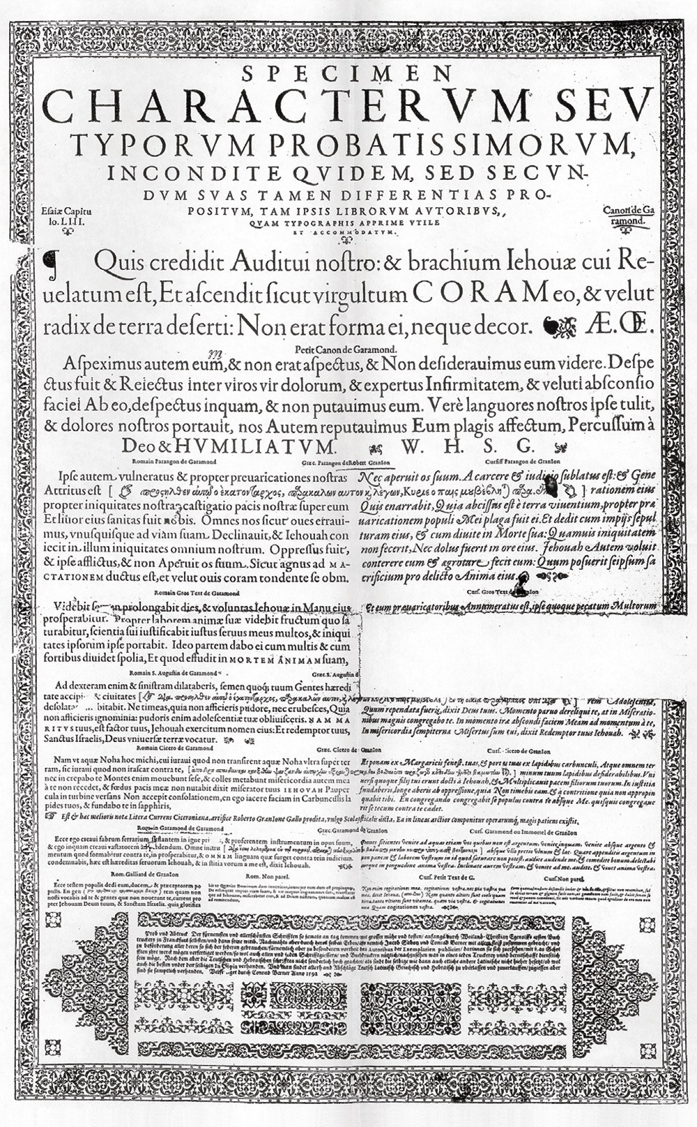
The argument that we do not have enough fonts at our disposition is as good as irrelevant: During the renaissance the typographer often had one font to work with, and yet this period produced some of the most beautiful typographical work.

Typographers shouldn’t care too much what kind of fonts they have at their disposal. The choice of fonts shouldn’t be our major concern. We should use what is available and use it the best we can.
Choosing a Typeface Is Not Typography
The second argument is not much better. Initially, the quality of printed letters was way worse than what we see on the screen nowadays. More importantly, if handled professionally, screen fonts are pretty well readable.
Web design is not about picking great typefaces, it is how we use them. Which is a huge difference. Anyone can buy typefaces. Few can discern quality typefaces from poor choices. But only very few master typography.
Treat Text as a User Interface
Yes, it can be annoying how different browsers and platforms render fonts. Yes, the low resolution issues make it hard to stay focused for more than five minutes. But, well, it is part of a web designer’s job to make sure that texts are easy and nice to read on all major browsers and platforms. Correct leading, word and letter spacing, active white space, and dosed use of color help readability. But that’s not quite it. A great web designer knows how to work with text not just as content, he treats text as a user interface:


Slightly more famous examples of unornamental websites that treat text as interface are: google, eBay, craigslist, youtube, flickr, Digg, reddit, delicious. Control over typography is not just a basic design necessity. Knowing how to treat text as a user interface is the key factor for successful Web design. Successful websites manage to create a simple interface and a strong identity at the same time. But that’s another subject.
UPDATE: As it raised so many eyebrows, hands and questions I decided to write a follow up
Where to Start: Some Reading Tips
- The Elements of Typographic Style: Renowned typographer Robert Bringhurst brings clarity to the art of typography with this masterful style guide. Perfect place to start your journey into the rabbit holes of typography.
- Emil Ruder, Typographie: Emil Ruder’s Typography is the timeless textbook from which generations of typographer and graphic designers have learned their fundamentals. Ruder, one of the great twentieth-century typographers was a pioneer who abandoned the conventional rules of his discipline and replaced them with new rules that satisfied the requirements of his new typography.
- Grid Systems: From a professional for professionals, here is the definitive word on using grid systems in graphic design. Though Müller-Brockman first presented his interpretation of grid in 1961, this text is still useful today for anyone working in the latest computer-assisted design.
- Grid Systems: Although grid systems are the foundation for almost all typographic design, they are often associated with rigid, formulaic solutions. However, the belief that all great design is nonetheless based on grid systems (even if only subverted ones) suggests that few designers truly understand the complexities and potential riches of grid composition. An excellent introduction by Kimberly Elam.
- The Stroke: The Stroke puts forward a genuine theory of writing—that is, the concepts behind letters on the page, whether by pen, pencil, or brush. Concerned not with art calligraphy and beautiful forms, The Stroke is a description of the phenomenon of letters and how they are made in writing. Starting from basic principles, Gerrid Noordzij begins with the white space that creates definition by surrounding letters. Then, using simple geometrical concepts, he describes in minute detail how the strokes of writing can be formed. Delightful.
