Learning to design is learning to see, an adventure that gets more and more captivating the further you go. A love letter to our profession.
Our mind is not a camera. Seeing is not a passive act. We see what we expect to see, or, as Anaïs Nin put it so beautifully: “We don’t see things as they are, we see them as we are.” The idea that our perception is as much a result of what we are able to know as of what we expect to find is not new. Immanuel Kant’s Critique of Pure Reason is based on this insight:
Up to now it has been assumed that all our cognition must conform to the objects; but let us once try whether we do not get further by assuming that the objects must conform to our cognition.
In the meantime, cognitive psychology has followed Kant’s “Copernican Revolution-in-reverse”. Our perception is defined by what cognitive psychologists call a “perceptual set”.
Perceptual set is a tendency to perceive or notice some aspects of the available sensory data and ignore others. Perceptual set works in two ways: 1. The perceiver has certain expectations and focuses attention on particular aspects of the sensory data 2. The perceiver knows how to classify, understand and name selected data and what inferences to draw from it. —Perceptual Set, by Saul McLeod
The way expectation can influence our cognitive set can be illustrated quite easily:

Depending on how you read the diagram, you will read the characters in the middle as “13” or “B”.
The physical stimulus ‘13’ is the same in each case but is perceived differently because of the influence of the context in which it appears. We EXPECT to see a letter in the context of other letters of the alphabet, whereas we EXPECT to see numbers in the context of other numbers. —ibid.
The influence of past experience on perception can be demonstrated in the following puzzling experience:

In this case past experience of hearing or reading these common phrases can influence your perception, and make you ignore the errors that seem obvious once you have spotted them. Professional writers will probably notice, but many still have a hard time. If you failed the above test, and now see what you previously didn’t, you will immediately nod in agreement to the following thought:
We don’t see that we don’t see. —The Tree of Knowledge, Maturana & Varela
Our perceptual set can change short-term, for instance when we are hungry our sensitivity to the smell of food is strengthened. The way experience affects long-term perceptual sets can be studied by analyzing the different perceptive sets of professionals that are strongly influenced by what they know.
- Cooks and sommeliers are able to more clearly discern what they taste because through constant exposure they have improved senses, and also the vocabulary to express and discuss their impressions.
- When doctors look at X-rays, they see more because they know anatomy and what to look for in the mix of light and shadow. Over the years they have learned to more clearly discern slight differences in shape and shade that to us are indiscernible.
- When an architect enters a building, they see through the walls, and they understand the building as a four-dimensional space-time continuum.
- When fashion designers look at your outfit, they don’t simply see stylish clothes, they see cut, seam, material. They imagine how your clothes feel.
- When I open a web site or an app, I see information architecture, interaction design, typography… and I imagine the conversations between business, design, and technology that lead there.
Just like in the second experiment above, professionals see things that, while they are physically there, not everybody will perceive, unless they are pointed out.
Learning to See
Learning to design is, first of all, learning to see. Designers see more, and more precisely. This is a blessing and a curse—once we have learned to see design, both good and bad, we cannot un-see. The downside is that the more you learn to see, the more you lose your “common” eye, the eye you design for. This can be frustrating for us designers when we work for a customer with a bad eye and strong opinions. But this is no justification for designer arrogance or eye-rolling. Part of our job is to make the invisible visible, to clearly express what we see, feel and do. You can’t expect to sell what you can’t explain.
This is why excellent designers do not just develop a sharper eye. They try to keep their ability to see things as a customer would. You need a design eye to design, and a non-designer eye to feel what you designed.
See with one eye, feel with the other. —Paul Klee
Claiming that you can’t see well if you are not a designer might sound condescending, or at least old-fashioned, but this is not a post about designer superiority. Designers are as superior in design as doctors in medicine, or hair dressers in cutting hair. Of course there are good and bad designers, doctors, and hairdressers, and most of us fall somewhere in between.
In reality, “designer” and “not designer” are not split into two separate groups. You can develop an eye for design without ever going to school or even having designed yourself, and you can pick up some serious knowledge about design from design books. There is no doubt that if your perceptual set is comparable to a web designer’s point of view, for example an architect or industrial designer, it will be easier for you to see design in the same way a web designer would.
However, as much as seeing mistakes is always easier than doing things right, you will always see more with practical experience than from passive observation. There is no better training than imitation. When you learn to draw you do not primarily learn to move your hand, first you need to learn to perceive light and shadow as they really are, not what you think they are.
My approach to the artistic process is to trust my eyes, not my mind. —Kenn Backhaus
What applies to Backhaus doesn’t apply to Picasso:
I paint objects as I think them, not as I see them. —Picasso
Genius or mortal, you need to learn to discern what you see and what you think you see before you can paint either reality. The best way to learn to see is copying the masters. That applies to art as well as to any form of design.
By observing great examples of design with your own eyes, attempting to duplicate them with your own hand, you will feel, see, and eventually understand the invisible lines behind a great product at a deeper and deeper level. Some of these lines are more obvious, while others may be so delicate that the very designer that drew them might not consciously realize exactly why and how they happened.
I sometimes hear that once we know how things are made, we can’t create or enjoy them spontaneously anymore. As far as this concerns enjoyment, I completely disagree. For me the more I learn about the many ways of human expression—music, architecture, even sports, the more I enjoy observing the masters at work. How could one not enjoy observing functional beauty and the care for detail?
In the development of design skills, theory can get in the way of practice, but only until the theory becomes practice. With practice your intuition evolves, and the better you understand what you do, the deeper your intuition. Only once you do not consciously think about the theory anymore are you achieving mastery.
Design vs Taste
Design as functional beauty is an expert’s view on products. However, for non-designers “well designed” tends to mean nothing more than “I like it” or “it looks good to me”. This likability comes from the visual appearance of the object, and is a personal expression of taste—a feeling, not an analysis. Feelings such as “I like it” (or “I have a headache”) are not debatable.
Good design is when I like it. —Everybody
There’s nothing wrong with non-designers talking of “design” in terms only of likability and aesthetics. Indeed, it would be so much easier for everybody if good designs always looked nice and bad designs looked bad! Yet there are many ugly designs that work well. Look at Google, Reddit, Craigslist, or even iOS with a free aesthetic eye and you won’t find much that is formally sublime. But these interfaces work, so they are well designed.
This is because despite the more common use of the word, the technical term “design” is not primarily about appearance, fashion, superficial beauty, or personal taste.
[Design] is not just what it looks like and feels like. Design is how it works. —Steve Jobs
We can draw two axes: the layperson’s version from “ugly” to “pretty”, and the designer’s version from “broken” to “works well”. This is not the only way to look at design, but it makes a lot of sense when we talk about user interface design:

There is plenty of good design that is ugly, and of course there’s good design that both works well and looks pretty. But a design that doesn’t work can never be substantially good—ugly and broken is just worthless crap, and pretty and broken is phony or kitsch:
Was einer möchte und nicht kann, wird Kitsch (Desire lacking ability turns to Kitsch) —Jan Tschichold
“No design” in the literal sense is never a good quality of a product. “No design” is the diametrical opposite of “beautiful design”. Taken literally “no design” is, simply put, nothing but shit.

Still, some people use “no design” to mean “not pretty but functional”, which can still be “good design” for a design expert. I’d advise designers to avoid the confusing expression “no design” when you mean “functional design”.
The above chart also shows why I dislike the expression “minimal design”. If you take the expression “minimal design” literally, and just do what is absolutely necessary, you end up in the Bold quadrant.
But you want to be in the Beautiful quadrant. How do you get there? Usually you move from the center to the upper left into Bold. Because first of all you need to make it work. Once you are there, you need to move to the right. How do you get from Bold to Beautiful?
You don’t get there with cosmetics, you get there by taking care of the details, by polishing and refining what you have. This is ultimately a matter of trained taste, or what German speakers call Fingerspitzengefühl (literally, “finger-tip-feeling”).

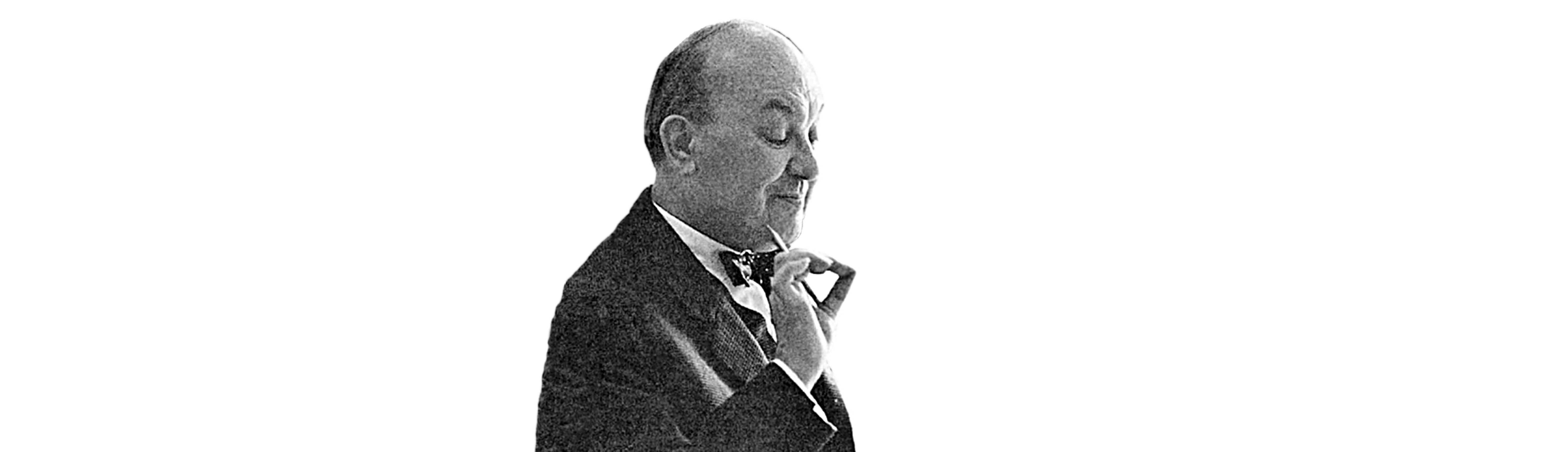
This quintessential portrait of typographer Jan Tschichold embodies the essence of the German concept, “Fingerspitzengefühl” – the intuitive touch and sensitivity in a creative process.
Personal taste vs sophistication
As we covered above, the everyday notion of “design” doesn’t say much about design as functional beauty. Personally (dis-)liking a color, form, or image is not a matter of design, it is a question of personal taste. And as we all know, when it comes to personal taste there is not much to talk about there. But in addition to personal taste there is something that we can call “trained taste” or “sophistication”. Let me recapitulate:
- Whether I like pink or not, sugar in my coffee, red or white wine, these things are a matter of personal taste. These are personal preferences, and both designers and non-designers have them. This is the taste we shouldn’t bother discussing.
- Whether I set a text’s line height to 100% or 150% is not a matter of taste, it is a matter of knowing the principles of typography.
- However, whether I set a text’s line height at 150% or 145% is a matter of Fingerspitzengefühl; wisdom in craft, or sophistication.
Obviously, beginners in design don’t have the same “finger-tip feeling” as Mr. Tschichold. Also, while your intuition grows with training and experience, your need for conscious control over the design process gets smaller and smaller the better you get at it. It’s like dancing or playing an instrument—the more advanced you are, the less you need to consciously think about it. The less you think about what you do, the more virtuosity you will be able to achieve.
Typography is a great example of this. A well-set book following the principles of typography is easier to read than a sloppy book that doesn’t. The experience of reading becomes measurably easier and thus definitely more pleasurable with good typography. The untrained eye won’t notice the quality of typography, good or bad, as long as we are not comparing extremes.
If you really hate someone, teach them to recognize bad kerning —XKCD
However, we will all enjoy reading a well-set text more, regardless of our typographic expertise. And the more typographic understanding you have, the more you’ll enjoy following the blueprint of a master’s trained taste. The same applies to well architected houses, finely engineered cars, and, to some degree, even to graphic design.
Form and So On
Now, despite our two axes above, there are many links between visual and functional beauty. From Dieter Rams’ “Ten principles for good design”:
Good design is aesthetic—The aesthetic quality of a product is integral to its usefulness because products we use every day affect our person and our well-being. But only well-executed objects can be beautiful.
Visual and functional beauty are not completely independent. Why is that?
A designer who is able to find the functional essence of a product will also likely find it in the visual aspects—they are usually interconnected, sometimes almost inevitably so.
Don’t count on an inevitable visual beauty when it comes to products with a heavy engineering aspect, like computers, web sites, or industrial complexes. There the conditions can be harsh, with the materials and standards we have to work with being bereft of much aesthetic refinement. In this kind of environment even a product with merely bold functionality can be perceived as visually pleasing, after you’ve used and understood the necessity of its bold shape.
Functional design is not completely self-evident on the object, it shows itself in use and affects the aesthetic perception. This is even more pronounced with software, where the outside hardly gives any hint how well (or even if) it actually works. However, this doesn’t mean that software needs to be hard to use. On the contrary. Whether we talk about hardware or software, usability is key, because:
Good design makes a product useful—A product is bought to be used. It has to satisfy certain criteria, not only functional, but also psychological and aesthetic. Good design emphasizes the usefulness of a product whilst disregarding anything that could possibly detract from it. —ibid.
Since professional designers focus on functional beauty and hard-to-spot detail, they can call things beautiful that may seem blunt, cold, or overly simple to a non-designer. This might explain why designers and non-designers sometimes come to like different things.
The more knowledge you have about a product’s inner workings, that is, if you can see the construction, the hidden mechanism, and glimpse the process leading to its current state, the easier it becomes to see its design. On the other hand, if the design process becomes too obvious, if the designer leaves too many traces on the product that shout “DESIGN!” without fulfilling its promise, it moves to the lower right quadrant of “kitsch”. Dieter Rams:
Good design is unobtrusive—Products fulfilling a purpose are like tools. They are neither decorative objects nor works of art. Their design should therefore be both neutral and restrained, to leave room for the user’s self-expression. —ibid.
Whether the inner workings show or not is far from a clear, unique distinction between good and bad design. If you shell the core interface though, you are probably moving again into the lower right corner.
Good design is honest—It does not make a product appear more innovative, powerful or valuable than it really is. It does not attempt to manipulate the consumer with promises that cannot be kept. —ibid.
In general, more advanced design is also less visible unless you’re looking for it. The customer doesn’t need to be bothered with the sketching and production of the object in order to use it. What the customer wants to understand is how the product is supposed to be used. There, the designer should aim to be as transparent as possible. (Although there are a few exceptions, as we will see later.)
Good design makes a product understandable—It clarifies the product’s structure. Better still, it can make the product talk. At best, it is self-explanatory. —ibid.
This is why as a rule of thumb advanced design stays largely invisible to the untrained eye. However, while professionals are able to more clearly perceive and understand the logic of the design behind a product, anyone can assess the quality of design through use.
- You don’t need to see and understand the engineering of a car to know if it’s well designed or not. If it runs well, it’s probably well designed.
- You don’t need to see how and why your TV works as it does. If you can’t figure out how to use it, it’s crap.
- You don’t need to know the different layers of web design to find out if a web site works or not. All you need to know if it’s good design is if it works for you.
How well something works is the only obvious criteria of good design. To decide whether an everyday object works for us or not, we don’t need to be experts. We know it when we use it.
Again, this is a rule of thumb. That not everybody can sit down at a piano and play away like Glenn Gould is not the piano’s fault. Your skills need to match the tool you are using to assess its quality—you can’t test-drive a car if you haven’t learned to drive. But everyday objects should only require everyday skills. This is what makes web design so hard.
Obviously, good interface design—and all product design is to some degree interface design—needs to somehow indicate its purpose and use. This is often more a matter of dealing with standards and expectations than of innovation. This makes the first of Dieter Rams’ rules one the hardest:
Good design is innovative—The possibilities for innovation are not, by any means, exhausted. Technological development is always offering new opportunities for innovative design. But innovative design always develops in tandem with innovative technology, and can never be an end in itself. —ibid.
If designers get too adventurous with usability, the result is generally a mishmash of quirky and hidden functions. When I say that good design is invisible, obviously I don’t mean obfuscating the use of a product by hiding the interface. Just like Dieter Rams doesn’t mean that good designers should be lazy when saying that good design is “as little design as possible”. Things that are hard to use by their intended audience are obviously bad design (I’m looking at you, adventurous “designer” faucets).
To make a product’s use obvious without distracting from the regular use is one of the hardest parts of the design job. The solution is almost never in implicit or explicit instructions (I’m looking at you, iPad magazine apps), but of reducing learned interaction patterns into simpler, yet still common patterns.
The art of reduction is not just “cutting things”. The cutting is merely the reduction part. The art of reduction is cutting away what is not essential, and adding detail to what is.
Good design is thorough down to the last detail—Nothing must be arbitrary or left to chance. Care and accuracy in the design process show respect towards the user. —ibid.
Beauty in design is not found by adding prettiness to a bold, functional design, it’s adding detail to the essence, so the functional logic becomes more humane, refined, and clear. As Edward Tufte said: “To clarify, add detail.”
User Interfaces
Seeing the design of all but the simplest user interfaces is about as hard as seeing the blueprints of a building only by looking at it from the outside. Why? Isn’t the interface just what I see on a screen? Hell no!
The confusion between the common and the expert definitions of “design” goes hand in hand with the general fuzziness we face when dealing with the term “interface”. In everyday language an “interface” is not “the way you accomplish tasks with a product”, but just the functional aspects of a product’s surface—the buttons and controls. When it comes to screen design, people often use the term “interface” to just describe the visible graphic elements on the screen. But the expert’s definition of “interface” is not primarily what you see on the screen.
The way that you accomplish tasks with a product—what you do and how it responds—that’s the interface —Jef Raskin
And again, using “interface” in the sense of only what you see on the screen or the surface of a product is not bad or wrong, it’s just the non-expert use. As interface designers we need to be careful. Our definition of “interface” is, again, not just what you see, but for better or worse how it works.
As I mentioned before, computer user interfaces can look incredibly ugly, yet still be very well designed because most of what we regard as interface is, alas, not visible. And you will not be surprised when I say again that a literal “no interface” is definitely not a good one.
The expressions “less interface”, “hidden interface”, “no UI” etc. are not literal. They are fuzzy rhetorical formulations that mix up the common and the technical definitions. What does this rhetoric aim at?
It targets only the bloated, overblown surface, ignoring the depth of an interface. What do these expressions try to say? They are trying to say the same thing as those who say “less is more”. However, if this translates to “hide how a product works”, or anything else that makes the product harder to use, the interface will become worse. On the other hand, less visual clutter does lead to a more efficient interface. Again, in Dieter Rams’ words:
Good design is as little design as possible—Less, but better—because it concentrates on the essential aspects, and the products are not burdened with non-essentials. Back to purity, back to simplicity. —ibid.
Less visual clutter leads to a more efficient interface. Technically speaking it is not quite clear what “less interface” means when you take that expression out of context.
- If by “less interface” you mean “harder to work with”, less interface will lead to a worse interface.
- If by “less interface” you mean reducing visual and functional elements to the essence, you will improve the interface.
- If by “less interface” you mean “hiding how a product works”, less interface will always lead to a weaker interface.
Discussing “more interface” or “less interface” out of context is prone to misunderstanding. While we have no right to tell people how to speak, as designers we have to communicate clearly. Here again, if in context it is clear what “less interface” means, maybe we should not be too pedantic about it either, and remember that
The slightest mistake looks incredibly stupid, when others make it. —Georg Christoph Lichtenberg
Conclusion
It is not the hand that makes the designer, it’s the eye. Learning to design is learning to see. Naturally, what designers learn to see as they improve their skills is usually related to design. Doctors don’t see web sites in the same way as web designers, just as web designers don’t see radiographs as doctors do. Our experience sharpens our eyes to certain perceptions and shapes what we expect to see, just as what we expect to see shapes our experience. Our reality is perspectival. Although we don’t perceive and sense things that a more experienced practitioner can, we can learn, and it’s very exciting and rewarding to do so.
The difference between good and great design tends to happen in a sphere that only experienced designers can perceive clearly. Still, most people can feel the difference between good and bad design. As I mentioned above, very few people perceive the delicacies of great typography, and even fewer can set type, but most of us will feel that a well typeset book reads better. This seems like a paradox. But think about it: the aim of design is to facilitate use, and take care of details that are tedious for the inexperienced person. What looks paradoxical from outside is perfectly logical from an inside perspective.
A lot of confusion arises from the fact that there are many ways to use the term “design”. The common definition (a matter of taste) is incommensurable with the professional definition of design as a matter of functional beauty and care for detail. While everybody can sense the design quality of a product through use, no one has authority on matters of taste. Still, and to hammer it in, by learning to design you evolve an eye for design, as well as a more refined taste to discern subtle design details.
Now, if you are a designer and proud of your skills, keep in mind: There are not distinct groups of “designers” and “non-designers”—it’s a continuum. And there is no such thing as the worst or greatest designer, since design requires a lot of different talents that can’t be directly compared. Some have deeper imagination, are better with the purely functional aspects, have more talent in polishing details, have better technical skills, and some will shine with an unbreakable will to ship. It is a long way from novice to pro, but what we all have in common is the trained ability to see what others don’t, to create what others can’t see but only feel.
The same confusion that leads to pedantic fights over what design really is arises when we mix the common definition of “interface” in the sense of “computer graphics” with the more abstract and technical definition that involves how something works, including the physical interaction and the user’s perception. It is possible to say a lot of cool shit about design or interface design by making a mess while meaning the right thing. So before we get into teaching and preaching mode we need to consider the context and try to understand what is meant.
It’s easy to score marketing points by saying “No UI” is better than “a lot of UI”, even though strictly speaking this relies on imprecise language. If by “no UI” you indeed mean that hiding the UI is a great idea, then let’s hope that you are designing child locks. Unless your purpose is to make your UI inaccessible, hiding interfaces is always a bad idea.
As with design in general, user interface design has to be assessed in terms of functionality and care for detail.
A UI that works is not a priori self-evident to everybody. Tools need to work for those who use them. That being said, everyday objects like faucets, hammers, and iPad magazines need to be considerably more self-evident than violins, airplane cockpits, or Magnetic Resonance Imaging machines.
After getting lost in the labyrinth of design and aesthetics, I think that I have found a way out that doesn’t oversimplify or fuel egos, but invites everyone to see more. I suspect there are shorter, easier ways, but I can’t see them… yet. Maybe it needs a non-designer’s perspective from outside to say it all in fewer words.
When everyone has the same Mac and the same internet, the difference between hackneyed graphic design and extraordinary graphic design is just one thing—the ability to see. Seeing, despite the name, isn’t merely visual. —Learning how to see, by Seth Godin
If you scrolled down to find the article’s essence in a last nutshell paragraph: Designers are not superior creatures that can ignore listening to other, supposedly inferior beings. On the contrary! Without critical feedback and the modesty to accept all opinions on our work as a perfectly valid, different view no matter who, how or what, we lose our freaky key ability, which is not just to see more, but to see more with one eye, and feel with the other.